

Responsive Web Design
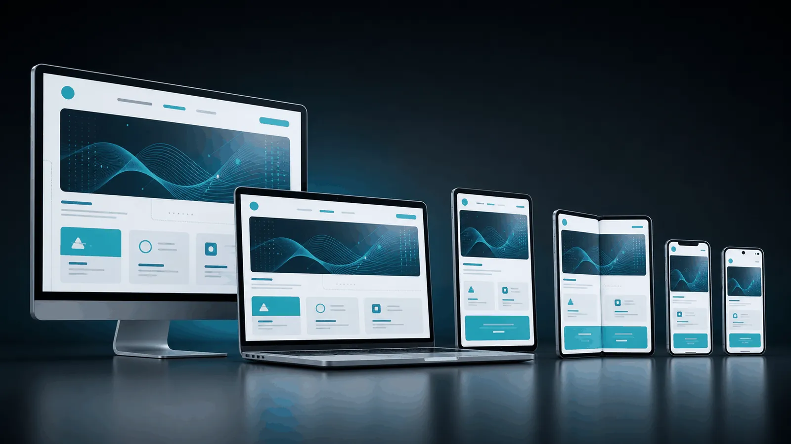
Responsive web design makes your website feel clear and usable on every screen, from large desktop monitors to tablets and mobile phones.
We design responsive websites with flexible layouts, readable content, stable components, and device-aware interaction patterns so users get a polished experience wherever they visit.
One Website Experience Across Every Screen
Responsive design is more than shrinking a desktop page. We plan content order, navigation behavior, spacing, images, buttons, and interaction states so each breakpoint feels intentional.
Mobile-First Layouts
Content, navigation, and actions prioritized for smaller screens before scaling upward.
Flexible Components
Sections, cards, grids, media, and controls designed to adapt without breaking.
Readable Interfaces
Typography, spacing, touch targets, and visual hierarchy tuned for each device range.
Performance Awareness
Design choices consider image weight, layout stability, and fast user interactions.
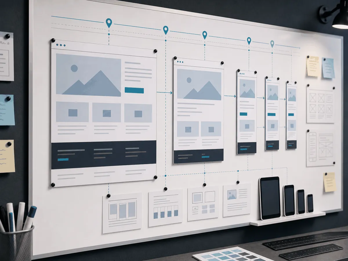
Design That Holds Up On Real Devices
We think through how sections stack, crop, resize, and behave when the viewport changes.
The result is a website that looks professional across screen sizes instead of feeling like a desktop design forced onto mobile.
Book A Call NowBook A Call NowWorking process
Our responsive design process defines device priorities, layout behavior, component rules, and implementation guidance.
Content Priority
We define the most important actions and content for each device context.
Breakpoint Planning
We plan layouts for mobile, tablet, laptop, and desktop experiences.
Responsive Design
We design adaptive sections, navigation, grids, images, and forms.
Developer Handoff
We prepare specs and responsive guidance for build and QA.
Frequently Asked
Questions

Need A Website That Works Everywhere?
Responsive web design creates layouts that adapt to different screen sizes so the site remains usable on desktop, tablet, and mobile.
Mobile design is part of responsive design, but responsive work also considers tablets, laptops, wide screens, and layout transitions.
Yes. We can redesign or adjust existing layouts to improve mobile and cross-device usability.
Yes. Tablet and intermediate breakpoints can be included where the content needs custom layout handling.
It can. Better readability, navigation, speed, and mobile usability often reduce friction for visitors.
What is responsive web design?
Responsive web design makes a website adapt to every screen size, so phones, tablets and desktops all get a fast, readable experience. It is also the format Google recommends for mobile-first indexing.
Who it is for
Businesses with a dated or desktop-only site that need a modern mobile-first website.
What is included
Mobile-first layouts
Designed from the smallest screen up.
Flexible components
Grids, images and type that adapt.
Performance focus
Optimised images and clean code.
Cross-device testing
Checks on real devices and browsers.
How long it takes
Typically three to eight weeks depending on page count.
What affects the cost
- Number of unique page templates
- Custom features
- Content and imagery needs
Common mistakes to avoid
- Hiding important content on mobile
- Tiny tap targets
- Heavy sliders that slow phones
Responsive Web Design for businesses in Pakistan, the UAE & the USA
Tkmonk is a Pakistan-based studio that delivers responsive web design for businesses that need a modern, mobile-first website. Tkmonk designs websites for businesses in Pakistan, the UAE and the USA. Every site is designed in Figma around your audience, tested as a prototype and handed off clean for development.