Website whitespace planning should address a specific problem. Large empty areas are mistaken for clarity even when important information is pushed away. A useful brief identifies the decision to make and the evidence needed to assess it.

Plan website whitespace planning around the task
Use spacing to group related information and preserve a sensible reading order. For business and ecommerce teams, the brief should explain what will be different for the person using or maintaining the website.
A realistic planning example
A mobile homepage brings the service explanation near its headline instead of leaving a decorative gap above the enquiry route. Treat this as an illustrative scenario. The right response still depends on the audience, constraints and evidence available for your own project.
A practical review sequence
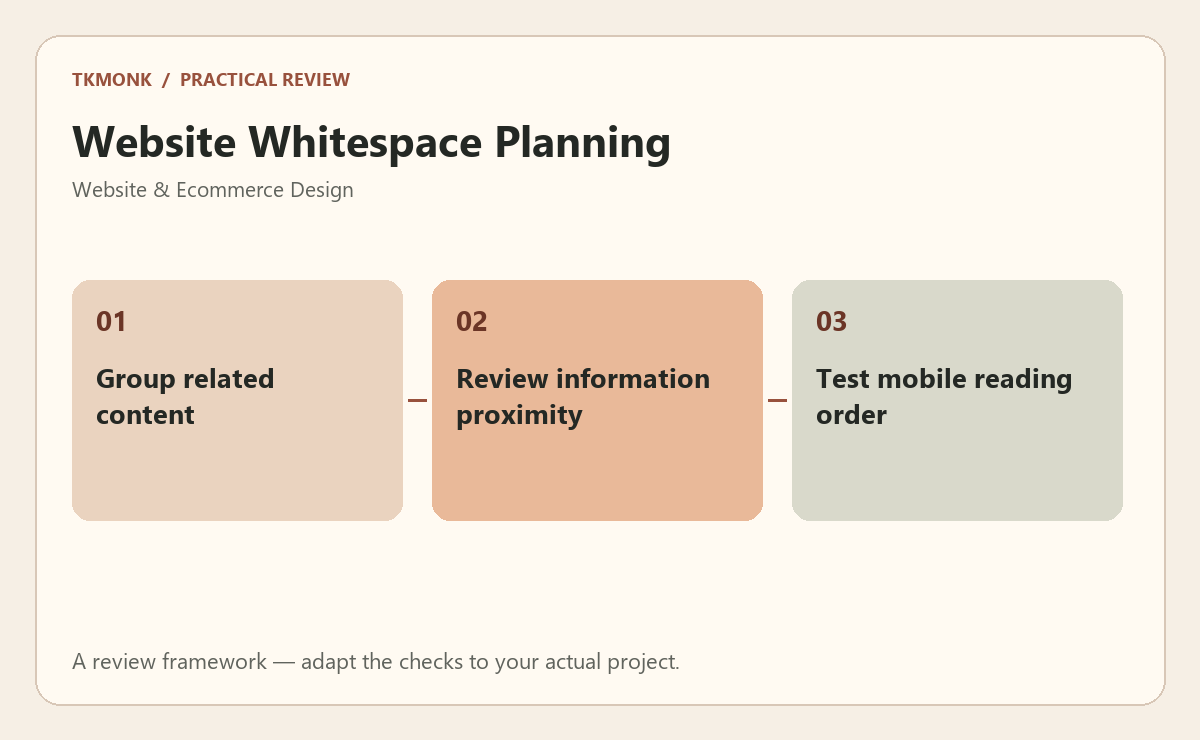
- Group related content. Check both the ordinary case and a less convenient variation so the rule is useful beyond the presentation.
- Review information proximity. Make the acceptance question specific enough that another person can repeat the review without guessing.
- Test mobile reading order. Keep the decision and its reason together. This makes later changes easier to assess rather than repeating the original debate.
Check website whitespace planning before approval
Use an annotated page with realistic content to make the decision visible. Review the page on a phone as well as a desktop. Use real product names, longer headings and representative customer information. Ask a reviewer to explain what the business offers and what they would do next. Record the answer rather than assuming the intended hierarchy is obvious.
A common mistake to avoid
Do not replace missing information with decorative badges or broad promises. The visitor needs an understandable offer, relevant evidence and a working next step. Visual polish should make those elements easier to evaluate, not push them farther down the page.
Your next step
For website whitespace planning, keep the review tied to the original problem. Use the website design brief guide to prepare the wider brief, or explore responsive website design if you need help defining the work.
Further reading: Typography guide and Image guidance. These resources provide broader background; adapt the practical review to your specific situation.