Mobile menu architecture should address a specific problem. A desktop menu becomes a long mobile list with unclear groups and duplicate routes. A useful brief identifies the decision to make and the evidence needed to assess it.
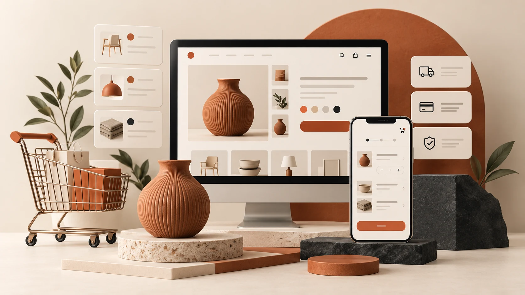
Plan mobile menu architecture around the task
Group links around visitor tasks and provide predictable expand and close behavior. For business and ecommerce teams, the brief should explain what will be different for the person using or maintaining the website.
A realistic planning example
A studio separates main services from detailed subservices without requiring users to inspect every category. Treat this as an illustrative scenario. The right response still depends on the audience, constraints and evidence available for your own project.
A practical review sequence
- Group related destinations. Review this in context with the surrounding information. An isolated component may behave differently in the complete journey.
- Show expansion clearly. Retain a brief record of the approved choice and any remaining limitation so handoff does not turn uncertainty into a promise.
- Provide reliable closing behavior. Write down what a reviewer should be able to confirm, and keep a concrete example beside the requirement.
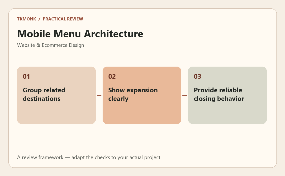
Check mobile menu architecture before approval
Use an annotated page with realistic content to make the decision visible. Review the page on a phone as well as a desktop. Use real product names, longer headings and representative customer information. Ask a reviewer to explain what the business offers and what they would do next. Record the answer rather than assuming the intended hierarchy is obvious.
A common mistake to avoid
Do not replace missing information with decorative badges or broad promises. The visitor needs an understandable offer, relevant evidence and a working next step. Visual polish should make those elements easier to evaluate, not push them farther down the page.
Your next step
For mobile menu architecture, keep the review tied to the original problem. Use the website design brief guide to prepare the wider brief, or explore responsive website design if you need help defining the work.
Further reading: Forms tutorial and Images tutorial. These resources provide broader background; adapt the practical review to your specific situation.