Mobile dashboard UX should address a specific problem. A desktop dashboard shrinks onto a phone without preserving useful actions. A useful brief identifies the decision to make and the evidence needed to assess it.

Plan mobile dashboard UX around the task
Prioritize the mobile task and offer deeper information through deliberate navigation. For product teams, the brief should explain what will be different for the person using or maintaining the interface.
A realistic planning example
A field supervisor can approve one request on a phone without navigating a compressed twelve-column table. Treat this as an illustrative scenario. The right response still depends on the audience, constraints and evidence available for your own project.
A practical review sequence
- Define mobile tasks. Agree who owns this check and what evidence is needed before the work can be considered ready.
- Reduce competing information. Use realistic material instead of an idealized placeholder, then note anything that becomes unclear.
- Keep actions reachable. Check both the ordinary case and a less convenient variation so the rule is useful beyond the presentation.
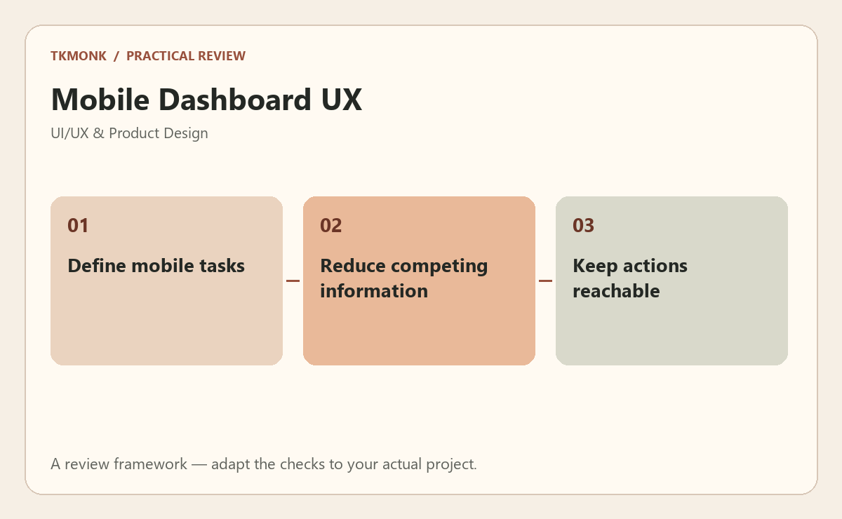
Check mobile dashboard UX before approval
Use a small prototype or annotated flow to make the decision visible. Ask someone familiar with the task to attempt it without coaching. Observe what they understand, where they hesitate and whether they recover after a mistake. Test relevant keyboard and narrow-screen behavior as part of that journey. A screen that looks convincing in a presentation still needs to make sense in use.
A common mistake to avoid
Avoid solving the issue through visual emphasis alone. A brighter button cannot repair an unclear permission boundary, missing recovery route or unsupported assumption. Record the intended behavior so design and implementation do not quietly diverge.
Your next step
For mobile dashboard UX, keep the review tied to the original problem. Use design systems for small teams to prepare the wider brief, or explore interface and portal development if you need help defining the work.
Further reading: Combobox pattern and Forms tutorial. These resources provide broader background; adapt the practical review to your specific situation.